Graphic Design
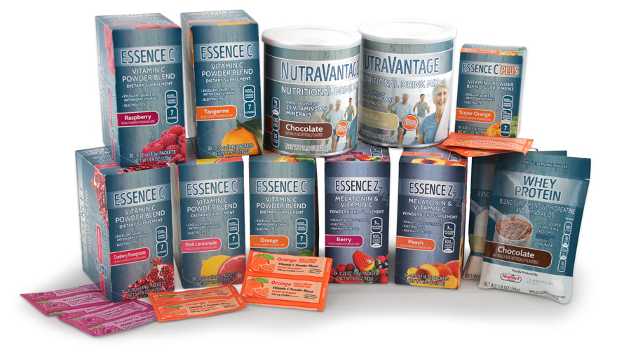
This line of dietary supplements was developed and implemented as sales samples for the private label division of a major food manufacturer. The samples were printed and packaged with product to be distributed by the sales team at sales meetings and trade shows to showcase specific supplement products available through the private label division.
|
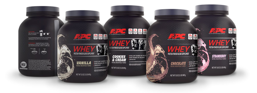
APC® (Active Performance Complex) Brand of dietary supplement products was developed for the private label division of a major food manufacturing company. After re-branding the product line with a new logo, canister packaging was created for a new plant derived protein powder mix. The packaging was intended to reflect a more natural approach to protein powders appealing more to everyday health food enthusiasts.
|
Canister packaging for APC® Whey Protein Powder was developed and marketed towards individuals using protein powder mixes within the athletic performance and weight training demographic. The product was created as a private label alternative to more costly national brand equivalents. Shrink wrap packaging was designed for four flavors and offered in one and two pound canisters.
|
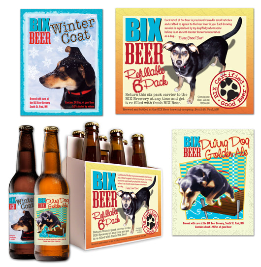
Bottle labels and six pack carrier designed for a local up and coming micro-brewery. The brewery was named after the brewers dog "Bixby" so the client wanted to use the dogs image as their trademark. The designs were printed in four color and distributed as beer samples to friends and local establishments.
|
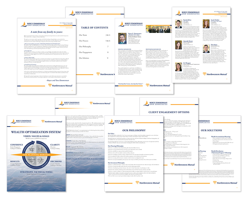
This informational packet was produced for Royce Zimmerman and Associates, a wealth management firm in Denver, Colorado under the Northwestern Mutual umbrella. The pages were distributed to new and potential clients with the intention of introducing clients to the planning team as well as outline the business philosophy and strategies practiced within the firm. The packet was formatted to be e-mailed as a pdf file or printed.
|
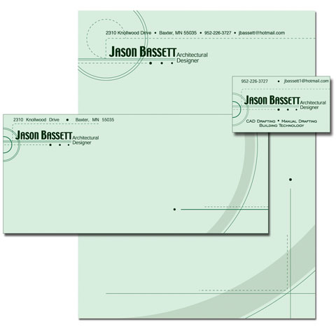
This business card with stationary layout was designed for an Architectual Draftsman looking to identify his business within the architectural and contracting industries. The design consisted of text treatment, without the use of a logo, combined with geometric elements that would be associated with architectural drafting.
|
|
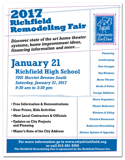
This 8.5" x 11" insert was created to promote a home improvement fair in Richfield Minnesota. The sponsors of the fair wanted to include a significant amount of copy so the challenge of the design came with laying out all of the copy within an easily readable, free flowing layout. The page layout was printed in three pantone colors and distributed as newspaper inserts and displayed as advertising signage.
|
|
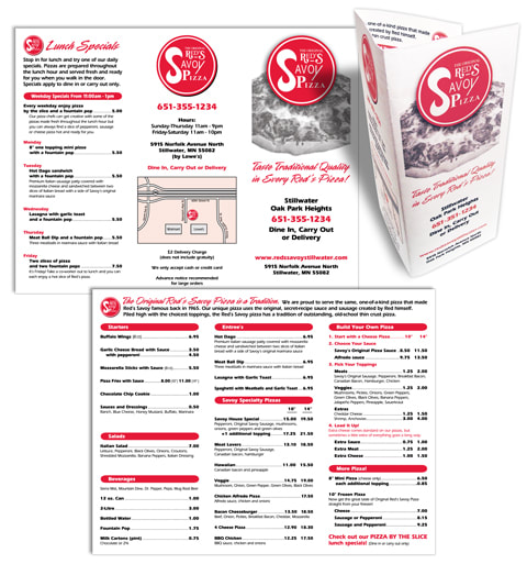
This tri-fold take out menu was designed for a local pizza shop in the Twin Cities. The menu was displayed in the store and delivered to local homes and businesses. The layout was printed in two color on the front and back of 8 1/2" x 11" bright white 24lb. paper. The final product proved to be a well displayed full menu with printing costs kept to a minimum.
|
|
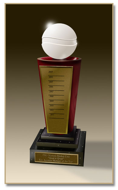
This digital product rendering was created for a custom award project to be produced for the Pepsi corporation. The award program was developed to recognize international sales achievement with Pepsi. The construction consisted of a simulated marble base with a contoured cherry wood pedistal and frosted crystal globe at the top etched to mimic the Pepsi logo. Brass chemically etched plates were attached to the front surface and personalized to specific sales districts. The rendering was produced using Adobe Photoshop and Ashlar Vellum used for 3D drafting. The image was digitally printed at large scale, mounted and used in the product proposal to Pepsi.
|
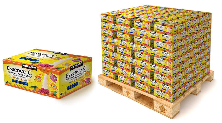
These packaging renderings were created for a sales presentation to Costco showcasing bulk carton packaging for a private label line of vitamin C powder supplement packets. The client wanted to present a single ninety count carton concept as well as a representation of how the cartons would be packaged on a pallet and displayed in a warehouse style retail setting.
